Tuesday, 4 December 2012

Good inclusion of supportive text


I found Andrew Books includes his supportive text within the thumbnails for each given project.
I thought that was a great idea as the text opens up to fill the same space as the images and does't force itself upon the user, It can be skipped past as can the images, however should they wish, they can spend as much time as they require reading it. Also the end user is given the choice as to when they view it. prior to of after viewing the images.

With my idea this would work perfectly as well as maintaining consistency.

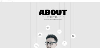
nice about me page


Finding this and thinking about my new design I can really imagine my about page becoming a nice almost interactive function which is both informative and aesthetically pleasing.
I envision a collection of shapes. One containing a picture of me. another which allows the user to download a pdf of my portfolio. Another which offers the option to download my CV. Some could contain testimonials. One a more traditional about me page. Others could pull recent tweets and status updates and act as links to my other social networking sites.

research


Above is an example which illustrates subtle introduction of colour and imagery in shapes. Both elements I have previously mentioned I was thinking of to push my design forward.

The example below shows images really tightly cropped into shapes which act as thumbnails (exactly what I had in mind) I looked at how these function, and they slightly increase 
 in side upon hover and when you click the go to a full screen where the image is visible full screen (light box kind of function)
This is something I really like and I think this. in combination with the colour coding would work really well to make my site unusual and interesting yet simplistic and subtle.
I am not sure I like the enlarging of the shape upon hover, instead i invasion a semi transparent fill which would appear over the image upon hover this would then reveal the title of the project which lies behind it.
When already on a project page the thumbnails would mimic the positioning and structure (if that doesn't become boring) and upon click the image would expand (almost feel like it grows) out into the new screen where you can then navigate through the images with the arrows or mouse (an arrows would appear upon hover on the left or right [ could possibly make those static])

When more than one page of thumbnails is required I would have and arrow to indicate this and lets say for example there wasn't another full set of shapes required. Lets say only 4. The first four would roll away and they would shuffle along with the four new ones moving onto the end.


Monday, 3 December 2012

colour coding pages

I found this website which utilises this idea I have previously mentioned of colour coding title headings/menu buttons with the main content.
I previously stated I really like this idea as it means the user is constantly aware of their location within the site as well as subtly introducing colour into the site without it being overwhelming.


Sunday, 2 December 2012

"see it framed"

As mentioned previously I am certain I want to include some sort of function on my site which affords the user the option to see the images framed and alone on screen without distraction.
This eventually is something I would like to link with a purchase option.
I found on Allposters.com they had a similar function which helped me imagine how it would potentially work on my site.


As you can see all posters.com offers the user many choices of frames. wall colours, print sizes and even room environments in which to view the image. This is a lot more complicated that I intend.
I found this process on their site to be fairly complicated. I want my options to be the complete opposite. Simple, showing only the work. isolated and with a choice of frames. (potentially 3)

more research

After discovering problems with my past designs (as previously outlined) I decided to do some more research baring in mind the elements I now know I do and do not like, and which elements I now feel work for me and my needs and vision of my site.


URBAN EARS - a headphone brand have a site that I have always admired, I thought about this and extended my research beyond photography/illustration/art and design sites and looked at the elements and functionality of them.
I liked how the urban ears website was explosive with colour yet the minimal construction of the site meant it didn't feel too cluttered and the colours didn't feel overpowering. I am aware that when using colours on a photographic site I must pay attention to assure no distraction/confliction occurs with the images.


With this site in particular I liked the way the products had been photographed to maximise the users understanding of the colour. This website was very useful for me as colour appears to be of great significance. I liked the way the products had also been shot in an unique way which made me consider the delivery of my images. I am thinking about the potential of displaying my work photographed in an environment (a photo of a photo) Additionally I am considering ways of presenting the thumbnails which will make my site more personal and reflect my own creativity more than having a generic square/rectangular shape. However I acknowledge that the images are the pivotal point of the site and therefore would display the images large scale in a more traditional manner.

Saturday, 1 December 2012

more designs and found faults

this was my next idea which I feel combined many of the strongest elements from previous attempts. The black and white option plus the full screen toggle and the option to hide the menu have all remained, I have used subtle colours and a very faint texture/pattern. Each page's fill colour will correspond to the colour of the menu tab so the end user is always aware of there exact location at any given time.
Again (although not included on this sample) my logo would be permanently visible on the page (top left in this example - as with others)


With this next design I adopted many of the features from the previous, for example the subtle texture and colour overlays. The left aligned menu with option to be hidden. The logo always visible and the full screen and black and white options in the top left. Again where appropriate the framing options would be visible.
With this design the two main differences you will notice are the extension of the canvas height as I began to think about placement of supportive text and how I could make this optional reading without having to sacrifice my image space. I figured the text could sit below and where appropriate some icon would appear bottom right, just above the fold to indicate there is text available.

The only problem in my mind with this is that the fold varies from screen to screen and the user may not confine to a regular window shape or size. In that sense I am now uncertain about this method of including supportive text especially as I want as much control over the way my site is viewed as possible. (back to the drawing board on that)

Another difference you may notice is that the menu bar isn't structured by a transparent box as it is in previous designs. I felt the rounded edges mimicked the playfulness of these pastel colours much better. I problem I then encountered was how to place my logo and actually make it look like it belonged rather than just simply being there.

I encountered a major problem when attempting to push these two designs forward, the problem being the sub menus. I tried many different methods but hated the way they expanded, to me it felt a lot more like a windows start menu and although I have never been concerned about this when viewing others sites when I began to apply it to mine I found I really detested it.
I now plan on rethinking my navigation system so that the sub menus do not have to travel across the screen (or down) but also keeping required clicks to a minimum before landing on an interesting visual page. I need to rethink a method of including supportive text where neccessary in such a way that doesn't hinder my ability to maximise the control i have over the way my site is viewed.

The good thing I have gained from so much experimentation, although it could be seen as wasted time, i would argue otherwise, as I have been able to eliminate elements which aren't working and select the features which are.
The elements I will definitely be keeping is the option to hide the menu, my logo will always be on screen. Supportive text will be option and NOT forced media.
navigation system will be simpler and more aesthetically pleasing.
The "see it framed" option - where appropriate.
I will be keeping a splash/ entry page which sets the tone of the site, builds suspense and excites.