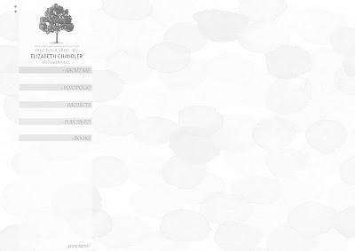
Here I tried using subtle colour and pattern, I looked to see how it would look when toggled to black and white (should the user prefer) and I tried it with images on top also.
There are elements of this I don't like at all however I am not quite sure what they are. I am certain that I like my added feature which you can see on the top right. the there boxes which will give the user the ability to see the image on it's own on a plain background with a choice of frames.
This feature plus the option to hide the menu are both things I am certain I wish to carry forward in the design. Additionally I am certain that I want to keep my logo on screen at all times and that this will be a link back to the home (landing page - not splash) upon click.


No comments:
Post a Comment